개발자 도구에서 확인할 수 있는 가장 중요한 selector는 state이다. 웹페이지에서 F12를 누르고 개발자 도구를 들어가서 확인해보자. 우측하단의 :hov를 눌러 확인해보면 다음과 같은 창이 뜬다.

위에 뜬 것이 state이다. 하나씩 살펴보자.
1.active
다음의 코드를 보자.
<!DOCTYPE html>
<html lang="en">
  <head>
    <meta charset="UTF-8" />
    <meta http-equiv="X-UA-Compatible" content="IE=edge" />
    <meta name="viewport" content="width=device-width, initial-scale=1.0" />
    <title>Document</title>
    <style>
      body {
        height: 1000vh;
        margin: 50px;
      }

      input:active {
        background-color: tomato;
      }
    </style>
  </head>
  <body>
    <div>
      <input type="text" />
      <input type="text" />
    </div>
  </body>
</html>
그리고 결과를 확인해보자.
박스를 마우스로 눌러보면 색이 바뀌는 것을 알 수 있다. active는 마우스를 클릭했을 때 적용됨을 알 수 있다.
2.hover
스타일 코드를 다음과 같이 살짝 바꿔보자.
      input:hover {
        background-color: tomato;
      }
active대신 hover을 써줬다. 그리고 나서 결과를 확인해보자.
박스 위에 마우스 커서를 갖다대면 색이 바뀌는 것을 알 수 있다. hover은 마우스 커서를 올릴시 적용됨을 알 수 있다.
3.focus
스타일 코드를 마찬가지로 다음과 같이 살짝 바꿔보자.
      input:focus {
        background-color: tomato;
      }
hover대신 focus를 써줬다. 그리고 나서 결과를 확인해보자.
마우스로 왼쪽박스를 클릭한 뒤 키보드로 tab키를 눌러보자. 그럼 포커싱이 바뀌는 것을 볼 수 있다.
focus는 키보드나 마우스로 요소가 focused된 상태에 적용됨을 알 수 있다.
4.visited
visited는 링크에만 적용이 가능하다. 다음의 코드를 보자.
<!DOCTYPE html>
<html lang="en">
  <head>
    <meta charset="UTF-8" />
    <meta http-equiv="X-UA-Compatible" content="IE=edge" />
    <meta name="viewport" content="width=device-width, initial-scale=1.0" />
    <title>Document</title>
    <style>
      body {
        height: 1000vh;
        margin: 50px;
      }

      a:visited {
        color: tomato;
      }

    </style>
  </head>
  <body>
    <div>
      <a href="https://naver.com">Go to naver</a>
    </div>
  </body>
</html>
그리고 결과를 보면
아직 방문하지 않은 상태임을 알 수 있다. 그리고 방문을 하고 다시 확인해보자.
색이 바뀌었음을 알 수 있다! 이처럼 visited는 이미 다녀온 링크에 대해 스타일을 적용시킨다.
5.focus-within
focus는 키보드나 마우스로 요소가 focused된 상태에 적용이 되었었다. 그럼 focus-within은 뭘까?
다음의 코드를 보자.
<!DOCTYPE html>
<html lang="en">
  <head>
    <meta charset="UTF-8" />
    <meta http-equiv="X-UA-Compatible" content="IE=edge" />
    <meta name="viewport" content="width=device-width, initial-scale=1.0" />
    <title>Document</title>
    <style>
      body {
        height: 1000vh;
        margin: 50px;
      }

      form {
        border: 1px solid salmon;
        display: flex;
        flex-direction: column;
        padding: 20px;
      }
      form:focus-within {
        border-color: seagreen;
      }
    </style>
  </head>
  <body>
    <form>
      <input type="text" name="" id="" />
      <input type="text" name="" id="" />
      <input type="text" name="" id="" />
    </form>
  </body>
</html>
그리고 결과를 확인해보면
다음과 같음을 확인할 수 있다. 그리고 form안에 있는 3개의 input중 하나를 클릭해보자. 그러면

다음과 같이 form의 테두리 색깔이 바뀌었음을 확인할 수 있다!
따라서 focus-within은 부모 tag에 추가된 자식요소가 focused될 시 부모 tag에 스타일이 적용됨을 알 수 있다.
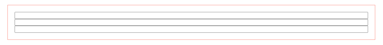
6.form:hover input{}
위의 코드에서 다음 부분을 살짝 수정해보자.
      form:hover input {
        background-color: sienna;
      }
그리고 나서 결과를 확인해보면

다음과 같이 나오는데 마우스 커서를 form 안쪽으로 갖다 대보면
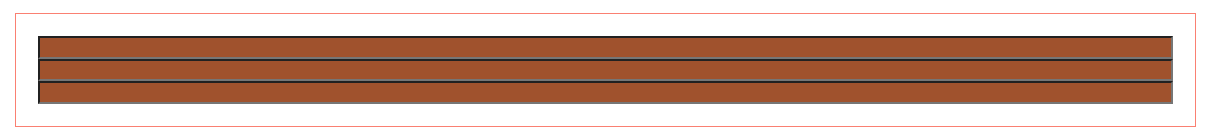
다음과 같이 3개의 input색이 변하는 것을 볼 수 있다.
따라서 form:hover input{}은 form(부모)가 hover상태면 input(자식)에게 스타일이 적용됨을 알 수 있다.
부모의 state에 따라 자식이 바뀌는 것이다.
7.form:hover input:focus{}
위의 코드에서 다음 부분을 살짝 수정해보자.
      form:hover input:focus {
        background-color: sienna;
      }
그리고 나서 결과를 확인해보면
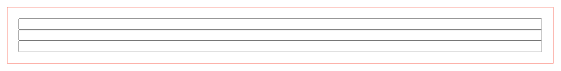
다음과 같이 나오는데 3개의 input중 하나를 클릭하여 focus하면
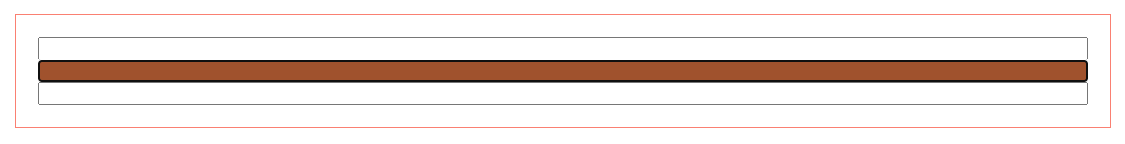
focused된 input색이 변하는 것을 볼 수 있다.
따라서 form:hover input:focus{}는 form(부모)이 hover상태인 동시에 input(자식)이 focused된 상태에서 input(자식)에게 스타일이 적용됨을 알 수 있다.
※ 요약 정리
a:link : 방문 전 링크 상태이다.
a:visited : 방문 후 링크 상태이다.
a:hover : 마우스 오버 했을 때 링크 상태이다.
a:active : 클릭 했을 때 링크 상태이다.
순서: 위에서부터 아래로 써야 원활히 적용됨!!
'WEB > HTML&CSS' 카테고리의 다른 글
| [HTML/CSS] #18.Variable (Custom property) (0) | 2022.01.14 |
|---|---|
| [HTML/CSS] #17.Pseudo Selector2 (0) | 2022.01.14 |
| [HTML/CSS] #15.attribute selector (0) | 2022.01.10 |
| [HTML/CSS] #14.Combinators (0) | 2022.01.02 |
| [HTML/CSS] #13.Pseudo Selector (0) | 2021.12.27 |


